Building the Bridge Between Design and Engineering
Creating a shared component system that transformed design decisions into scalable frontend architecture.
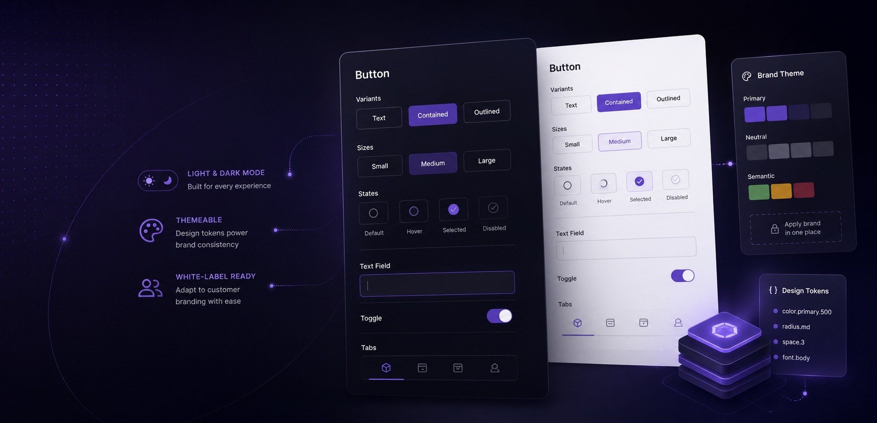
Bootstrap components were difficult to customize, leading to inconsistent implementations, duplicated patterns, and growing maintenance costs. We built a shared component system that connected design intent with implementation while supporting light mode, dark mode, and customer-specific branding from a single foundation.
Duration
Jan 2023 – Aug 2025
My Role
Staff Frontend Engineer
Team
Design, Product, Engineering
The Problem
Bootstrap gave us a common starting point, but not a common language. Teams wrapped Bootstrap components in styled-components, introduced styling props like $isBold, and created page-specific variations. By the time we evaluated the system, there were roughly 30 different button implementations across the application.
The Challenge
Design needed consistency. Engineering needed flexibility. The existing approach provided neither.
Creating a Shared Language
We established a small set of core component patterns and moved visual customization into the theme layer. The same buttons, forms, tabs, and inputs could support internal experiences, light and dark mode, and customer-specific branding requirements without requiring separate component implementations.
Moving Decisions Into the Theme
We moved styling decisions from individual components into the theme layer, allowing the same components to support internal applications, customer-branded Trust Centers, and light/dark mode experiences without requiring separate implementations.
Adoption Matters
We built Storybook with light and dark mode previews, documented component usage, and partnered with engineers to migrate existing experiences onto the shared system.
The Outcome
A shared component foundation that powers internal tools, customer-branded experiences, and light/dark mode from a single source of truth.
30+
Button variations consolidated into a standardized system
Shared
Component APIs used across products and experiences
Theme-Aware
Light mode, dark mode, and customer branding built in
Scalable
One foundation powering internal and customer-facing experiences
Impact
By building the bridge between design and engineering, we created a system that teams trust, designers rely on, and the product can evolve with confidence.
Back to Work