Building a Theme-Driven Platform
Enabling white labeling and dark mode at scale with design tokens
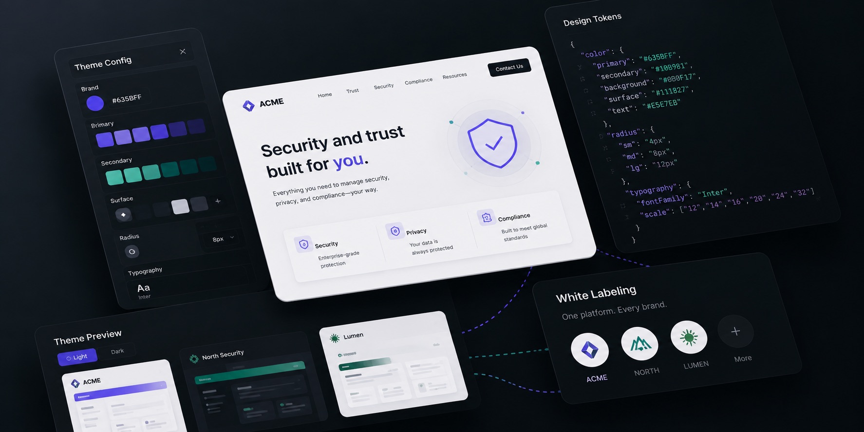
As SafeBase grew, customers needed their Trust Centers to reflect their own brand—not ours. I led the effort to build a scalable theming system that supports white labeling, multiple products, and light/dark mode from a single foundation.
Duration
2 Years
My Role
Lead Frontend Engineer
Team
6+ Engineers
The Challenge
Our original styling approach relied on Bootstrap overrides, styled-components, and product-specific implementations. Each new branding request added complexity and technical debt.
- Customizations were scattered and hard to scale
- Components behaved differently across products
- Styling changes often introduced regressions
- New themes required engineering effort
- Dark mode was difficult and expensive to implement
- No single source of truth for visual styling
My Approach
I reframed branding as a theming problem, not a component problem. By introducing a design token system, we separated visual decisions from component logic.
Design Tokens
A single source of truth for colors, typography, and spacing.
Theme-Aware Components
Components adapt automatically based on the active theme.
Multiple Themes
Create and manage themes for different products and customers.
Key Outcomes
Unified Theming
One theming architecture across App and Trust Center.
White Labeling at Scale
Customers can customize their brand without engineering effort.
Light & Dark Mode
Full light and dark mode support using the same system.
Reduced Duplication
Eliminated product-specific component variations and override chains.
Fewer Regressions
Consistent styling and tokens reduce bugs and visual drift.
Developer Velocity
Faster implementation of visual updates and new themes.
Enabling Dark Mode
Dark mode was once a highly requested feature but was nearly impossible to implement with our previous architecture. With design tokens, we introduced an alternate set of values for colors and surfaces—unlocking dark mode across the Trust Center without rewriting components.
Same components
No duplicate implementations. Just different token values.
Future-ready
The same architecture powers other products and new themes.
Impact
What was once a manual, error-prone process is now a scalable platform capability. By centralizing visual decisions into themes and design tokens, we enabled our customers to own their brand experience—without increasing complexity for engineering.
Back to Work